
In today’s digital landscape, where attention spans are short and the need for speed is paramount, optimizing web images for faster load times is crucial. Images play a pivotal role in web design, enhancing visual appeal and conveying information. However, they can also significantly impact a website’s performance if not optimized effectively. Slow-loading images can deter users, leading to higher bounce rates and diminished user experience. To counter this, employing image optimization techniques is essential for ensuring swift loading times without compromising on quality.
Choose the Right Image Format:
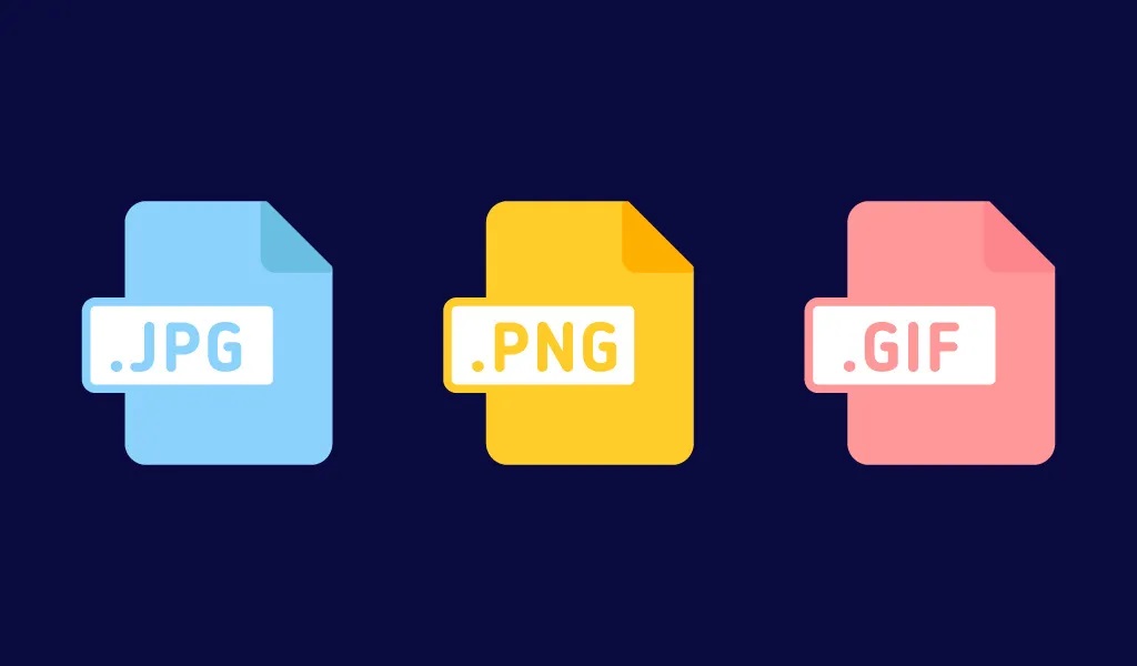
Selecting the appropriate file format is the first step in image optimization. The commonly used formats are JPEG, PNG, and GIF. Each has its strengths and best-use scenarios:
JPEG: Ideal for photographs and complex images with many colors. It offers a good balance between image quality and file size compression.
PNG: Suitable for images with transparency or sharp edges, such as logos and graphics. PNGs support lossless compression, maintaining high quality but potentially resulting in larger file sizes.
GIF: Often used for animated images, logos, and simple graphics. GIFs support animation but may have limited colors compared to other formats.
Compress Images without Compromising Quality:
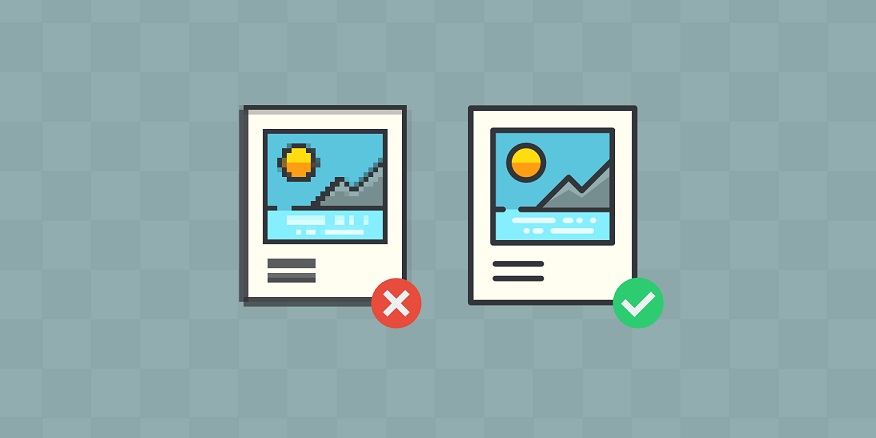
Image compression is a crucial technique to reduce file size without visibly impacting image quality. Use tools like Adobe Photoshop, GIMP, or online services such as TinyPNG or JPEGmini to compress images effectively. Balancing compression settings to achieve the smallest file size while retaining acceptable visual quality is key.
Resize Images for Web:
Large, high-resolution images consume more bandwidth and take longer to load. Resize images to their display size on the website. For instance, if an image is meant to be displayed at 800 pixels wide, there’s no need for a 4000-pixel-wide image. Scaling down the dimensions reduces file size and speeds up loading times significantly.
Leverage Responsive Images:
Implement responsive design techniques by using the HTML srcset attribute or the <picture> element to serve different-sized images based on the user’s device or screen size. This ensures that users receive appropriately sized images, reducing unnecessary data transfer.
Implement Lazy Loading:
Lazy loading is a technique where images are loaded only when they are about to enter the viewport. This reduces the initial load time of the webpage, as only images visible to the user are loaded, while others are loaded as the user scrolls.
Use Content Delivery Networks (CDNs):

CDNs store copies of your website’s assets, including images, across multiple servers worldwide. This helps in delivering content faster to users by serving them from a server geographically closer to their location, reducing latency and load times.
Optimizing web images for faster load times is a fundamental aspect of web development. By adopting these image optimization practices, web developers and designers can strike the perfect balance between visual appeal and performance, ensuring a seamless user experience that keeps visitors engaged and satisfied.